 Tony Carnevale
The short answer
Every day, check two things: whether a lead arrived and whether anything on the site broke. Visits, sources, conversion rate and rankings belong to the week and the month, read against the previous period, because a day on a small business site is a handful of visits. Set the daily part up as a push so it comes to you.
Key takeaways
- Switch on the no-leads alert first. It turns the question did anything come in into a push that fires only when the answer has been no for as many days as you set.
- Visits against the previous week, and the sources, are a weekly read. Direct is the absence of a referrer, so read it as a gap.
- Conversion rate, the ad verdict by platform and campaign, and keyword positions are monthly reads. A position is one reading from one place on one date.
- A 35% weekly swing on the demo site was eleven visits. Read the size of a move beside its direction before reacting.
- The morning summary arrives on the phone at 10am with yesterday against the day before, and the feed turns the period into cards you swipe through.
Every day, check two things: whether a lead arrived and whether anything on the site broke. That is the whole daily routine, and it takes less time than reading this paragraph. Visits, sources, bounce rate and rankings belong to the week and the month, and reading them every morning trains you to react to noise.
I have run Venbit since 2011 and I built the analytics product my clients use, and the habit I see hurt owners most is opening a dashboard, seeing visits down from yesterday, and changing something. On a small business site a day is a handful of visits.
The daily check: leads and breakage
A lead is a visit in which someone sent a form you can see, landed on a thank-you page you set, tapped your phone number, clicked your email address, or completed a goal you named. Forms and phone taps land in the inbox in Venbit's analytics with the page they came from and the source, and the daily job is to read the new ones and answer them, then mark each one contacted, won or lost so the inbox stays an accurate record of what the site produced.
If what counts as a lead on your site is still fuzzy, settle that first, because every other number is built on it. I wrote out how to name a page, a button or a form as a lead separately, including what value to type against it.
Breakage is the other daily item, and it is the one a dashboard will not show you. An error spike, a form that stopped sending, a traffic spike that is a scraper and not a customer. Those are alerts, and the right way to check them daily is to set them once and let the phone tell you. Standing in front of a chart looking for a form error is how it gets missed for two weeks.
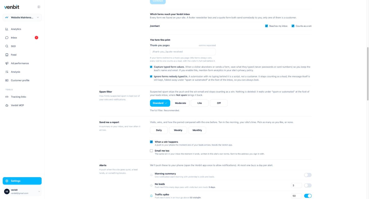
The alert I would switch on first is the one that says no leads have arrived for a set number of days. It turns the question did anything come in into a notification that fires only when the answer has been no for long enough to matter. For a site that gets a lead most days, three days of silence is worth a look at the form; for a site that gets two a month, set it to ten.
Why a daily visit count misleads
A day on a small business site is a small number. Here is the demo site's feed card for one week: 20 visits, down 35% on the seven days before, with Thursday the busiest day. Thirty-five percent sounds like news. It is eleven visits, spread over a week, which means on an average day fewer than three people arrived. One family deciding to shop around on a Thursday moves that card.
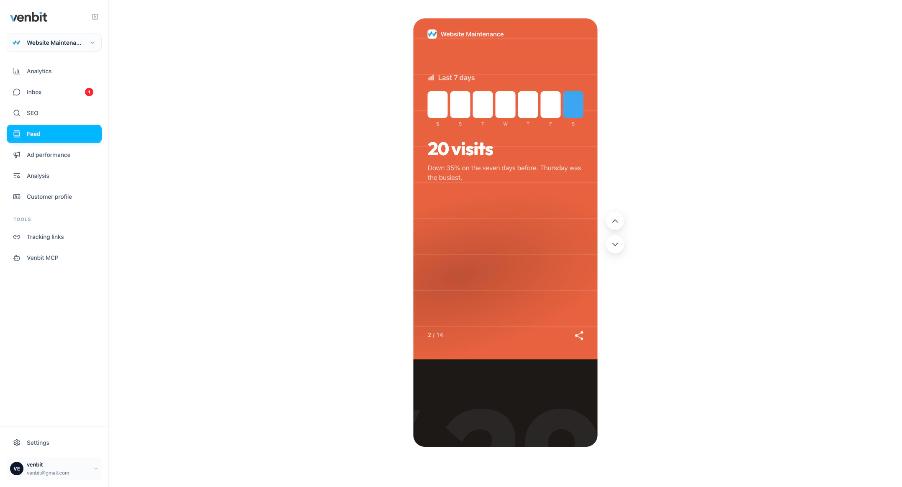
The reason to put a comparison beside every number is to show the size of a move as well as its direction. A week against the week before is the shortest comparison I trust on a site this size, and even then I read it for the shape, which day was busy and which source rose, before I read the percentage. If you want a sense of how many visits a site like yours should expect in the first place, the measured ranges are in a separate article.
The weekly check: visits and where they came from
Once a week, look at visits against the previous period and at the sources. The demo site's dashboard shows 347 visits over 30 days, up 173% on the period before, and a sources chart that reads Ads 221, Direct 70, AI Assistants 26, Social 24 and Search 5. The number I would look at longest on that screen is the search figure. Five visits from search in a month, against 221 from ads, says this site has bought nearly all of its traffic, and the week the campaign pauses it will go quiet.
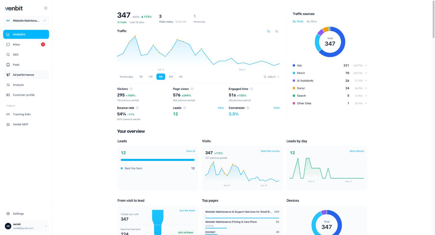
Direct deserves one plain sentence every time it appears. It is the absence of a referrer, which covers typed addresses, bookmarks, links in text messages and links in most email apps. A tool that gives it a confident label is guessing.
The AI Assistants slice is new enough that most owners have never seen it on a chart. It is people who clicked out of a ChatGPT or Copilot answer, which tag their links, and it is separated from ads because an assistant handing out your address is a listing, and nobody bought it.
If you are reading this in Google Analytics instead, the weekly check is the same two questions, and the comparison toggle does the previous-period work. What GA4 will and will not tell a small business is where I went through the rest of it.
The monthly check: conversion, ads and rankings
Conversion rate is the share of visits that became a lead, and on the demo site it is 3.5% over 30 days. It is a monthly number because its denominator is visits and its numerator is leads, and twelve leads over a month is a count you can read, where one lead over a day is a coin toss. Read it against last month, and read it beside the pages that produced the leads, because a conversion rate that fell while visits rose is a traffic story and not a website story.
The ad verdict is monthly for the same reason. Clicks, the leads they became, and how that rate compares with the rest of your traffic are only steady once a campaign has run for weeks. There is no spend in the data unless you type a daily budget, so there is no cost per lead to check, and anything derived from a budget you typed is labelled estimated wherever it appears. I prefer that to a number printed as if it were measured.
Rankings are a weekly glance and a monthly read. A position is one reading from one place on one date, so the daily movement of a keyword is mostly weather. The product checks the core keywords daily and everything deeper weekly, and tells you when one reaches page one, reaches the top three or falls off, with one push a day at most however many moved. How those alerts and the review notifications work is its own article.
| When | What to look at | The question it answers |
|---|---|---|
| Every day | New leads in the inbox; alerts for an error spike, form abandonment and a traffic spike | Did anyone get in touch, and is anything broken |
| Every week | Visits against last week; the sources; the trails of the leads | Where did people come from, and did the ad or the post do anything |
| Every month | Conversion rate; the ad verdict by platform and campaign; keyword positions and the value of page one; the customer profile | Is the spend producing leads, and where do the good ones come from |
| Rarely | Bounce rate, engaged time, page views | Context for the others, read when a monthly number moved |
The daily summary, pushed to your phone
The daily check should arrive on its own, which is why it is built as a push, a report and a feed. In Settings you choose a daily, weekly or monthly report, and a push when a win happens. The morning summary lands on the phone at 10am with yesterday in numbers against the day before, the busiest hour, where people came from and what they read.
In the iPhone app the feed shows the same period as cards you swipe through: each lead with its trail in three beats, yesterday's recap, a win when a keyword lands on page one or a job is marked won, one suggestion at a time with the evidence under it, and an alert only when something is wrong. The last card says you are caught up. It is always the site's own data, and when nothing moved the feed is short, which is the correct length for a quiet day.
What I leave alone
Bounce rate and engaged time. Both are defined strictly here, a bounce is one page, under ten seconds and no scroll, click or lead, and engaged time counts only while the tab is visible and focused, so neither is inflated by a tab left open. They are still descriptions of visits. A visit that tapped the phone number in eight seconds is a bounce by any definition and the best outcome the page could produce.
I read them when a monthly number moved and I want to know whether the visitors changed or the page did. I do not read them daily, and I would not recommend that anyone with a business to run does either.
Related services
More on reading your website's numbers
Every question in this series, from Website Analytics for Small Business Owners.
Leads inbox4
Ad performance4
SEO tracking3
Visitor behaviour4
Feed and notifications3
- How to See Who Is on Your Website Right Now
- What to Check in Website Analytics Every Day (you are here)
- Website Analytics App for iPhone: Stats, Widget and Push
Goals and measurement4

Tony Carnevale
Founder, Venbit
Tony started Venbit in Mill Creek, WA in 2011 and still does the work: web design, SEO, and the website analytics product the company builds and runs for its own clients. The numbers and screens in his articles come from that product, not from a content mill.
Sources
- Venbit metric definitions: visit, lead, conversion, bounce rate, engaged time, bot traffic