 Tony Carnevale
The short answer
The Venbit app for iPhone shows the same visits, leads, ad verdict and rankings as the web portal, and who is on it now. A push arrives when someone sends your form, taps your number or clicks your email, naming the person when the form gave a name. A widget carries the last seven days of visits and leads.
Key takeaways
- Every number in the app links to how it is measured: a visit ends after 30 minutes of inactivity, engaged time counts only while the tab is visible and focused, and a bounce is one page, under ten seconds, with no scroll, click or lead.
- The push for a form names the person when the form gave a name; open it and the message is there. The push for a phone tap says someone tapped the number, which is intent, not a connected call.
- The home screen widget shows the last seven days of visits, visitors and leads, and how many people are on the site right now.
- Ranking pushes are limited to one per site per day, however many keywords moved, and new Google reviews arrive the same way.
- The phone is for checking and answering. Analysis belongs on the wider screen, with the same data under it.
A website analytics app for iPhone has one job: let you check the site from a van, a kitchen or a waiting room and answer a lead before it goes cold. The Venbit app shows the same numbers as the web portal, visits, leads, the ad verdict, rankings, who is on the site now, with a push the moment a lead arrives and a home screen widget carrying the last seven days of visits and leads. It is on the App Store as Venbit Web Intelligence.
I run my own business from a phone most of the day, and I built this app for the version of me who is in a parking lot when a quote request comes in.
The same numbers as the web portal
The app's home screen is the dashboard: the traffic chart, then visitors, page views, engaged time, bounce rate, leads and conversion rate, each beside what it was in the previous period, so a dip of two visits reads as two visits and not as a trend. Switch the range to yesterday, a week, a month, a year or all time and the chart redraws. It reads from the same records as the web portal of Venbit's analytics, so a number on the phone and the same number at the desk cannot disagree.
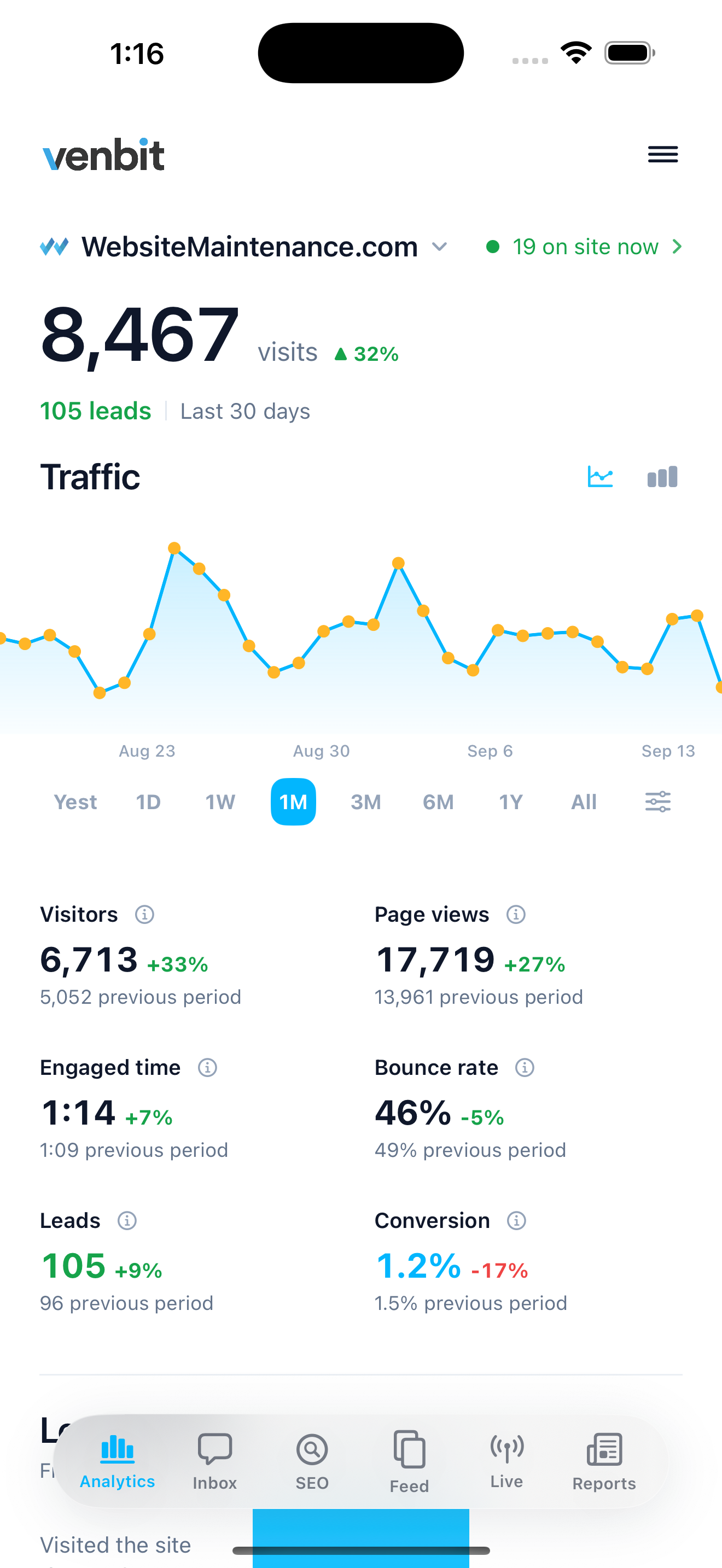
Under the cards is the funnel: visited the site, reached the form, became a lead, with the share that made each step. On the demo site that reads 6,676 visits, 975 at the form and 103 leads, the same figures shown on the app's own page. Crawlers, uptime monitors and datacenter traffic are removed before anything is counted, so each of those visits is a person, which is why the counts here run lower than a traffic estimator will tell you.
Every number links to how it is measured. A visit ends after 30 minutes of inactivity, the same window Google Analytics uses. Engaged time counts only while the tab is visible and focused. A bounce is one page, under ten seconds, and no scroll, click or lead. I put the definitions one tap away so nobody has to take my word for what a bounce is.
A push when you get a lead
This is the feature I would keep if I had to drop everything else. When someone sends your form, taps your phone number or clicks your email address, the phone gets a push that says what happened and, for a form, who sent it when they gave a name. The wording is deliberately flat, because someone reads it on a lock screen between other things.
- New lead on your site, then the person's name and just sent your form. When the form gave no name it uses the email address, and when it gave neither it says someone just sent your form.
- New lead on your site, someone just tapped your phone number.
- New lead on your site, someone just clicked your email address.
- New lead on your site, someone just reached your thank-you page.
- For a goal you named, such as a booking page reached: New lead on your site, someone just completed the goal, by its name, on a site that counts forms as leads. On a site that counts only goals the push names the goal instead, as Goal completed on your site or the goal's own sentence.
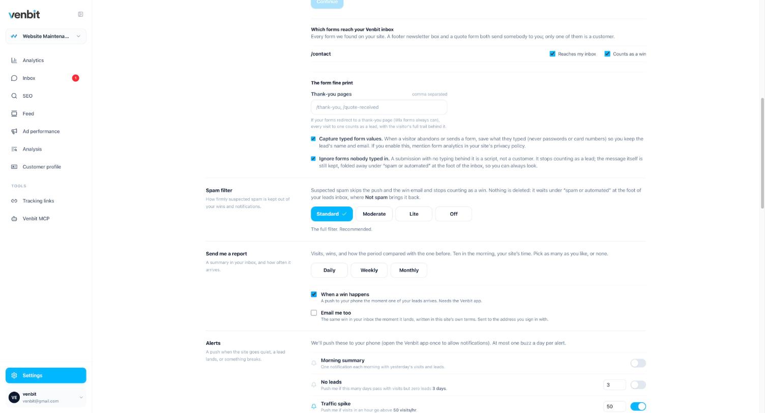
Two honesty points about those. A phone tap is intent, not a connected call: the tracker sees the tap on the number and cannot see whether the call went through or whether anyone picked up. And a form push fires on a submission the tracker could see, which is why which forms reach the inbox is a setting you check once, and why a push that names the person is worth more than a count.
Open the push and the lead opens: what was captured, where they came from, the page they wrote from, the device, the pages read before writing and the time on site, with the trail of the visit under it. Mark it new, contacted, won or lost and keep a note on it. I wrote the longer version of this in how to get notified when someone fills out your contact form, including the email path and why the inbox exists outside it.
The home screen widget
The home screen widget shows the last seven days: visits and leads at the small size, visitors added at the medium size, and a count of who is on the site right now whenever that is more than nobody. It fetches fresh numbers every twenty minutes. A widget that tried to carry a chart would be unreadable at that size, and the numbers an owner glances at between jobs are how many people came this week and whether any of them got in touch.
I expected the widget to be a novelty and it turned out to be the thing I look at most, because it answers the question without opening anything. A zero in the leads slot on a week that produced a few last time is a prompt to check whether the form is working.
Rankings and reviews on the lock screen
When a tracked keyword reaches page one, reaches the top three, or slips off page one, the app tells you, with the keyword in quotes and the positions it moved between as plain numbers. One ranking push per site per day, however many keywords moved, because five buzzes about five keywords is not five times the information. New Google reviews arrive the same way. Mute the kinds you do not want.
A position is one reading from one place on one date, so I read a ranking push as a flag to look at the chart and never as a verdict. The keyword screen in the app holds the history and the companies ranking above you on that search, with their ratings, which is what turns a one-day move into something you can judge.
Live, the inbox and the feed
Three more tabs. Live lists anyone active on the site in the last five minutes, newest first, with the page they are on and the last thing they did; I covered when watching live visitors is worth it separately, and the short answer is the hour after an ad or a mailer goes out.
The inbox is every form and phone tap with the city, the source and the pages read first. And the feed is the week as cards you swipe through: each lead with its trail in three beats, wins such as a keyword landing on page one or a job marked won, one suggestion at a time with its evidence, delivered daily, weekly or monthly with a push when a new one is ready. The last card says you are caught up.
The ad screen is the one I am asked about most. It opens with a paragraph that says whether the ads paid for themselves, then clicks by day, then the platforms and campaigns with the leads each produced. There is no spend in the data unless you type a daily budget, so there is no cost per lead on the screen, and anything worked out from a budget you typed is labelled estimated.
What the phone is for
Checking and answering. The app is where I see a lead and reply to it within the hour, glance at today's numbers, and get told when a ranking moved or a form broke. It is not where I do analysis, and I would be suspicious of any phone app that claimed to be. The questions that need a wider screen, which pages produced the leads this quarter, which towns the best customers live in, whether the ad spend by campaign held up, are in the web portal with the same data under them.
The app does not record screen video and does not name anonymous visitors. If a tool on the App Store promises either of those for a local business, read the fine print on how. For the free and simple alternatives, and what each one leaves out, the analytics tools comparison is honest about ours as well.
The phone also handles access. Invite a partner, a bookkeeper or the person who runs your ads to one site, choose whether they may see the leads and the ad numbers, and remove them in a tap. The tracking line on the website belongs to the site, so any number of people can look at it without a second install.
Related services
More on reading your website's numbers
Every question in this series, from Website Analytics for Small Business Owners.
Leads inbox4
Ad performance4
SEO tracking3
Visitor behaviour4
Feed and notifications3
- How to See Who Is on Your Website Right Now
- What to Check in Website Analytics Every Day
- Website Analytics App for iPhone: Stats, Widget and Push (you are here)
Goals and measurement4

Tony Carnevale
Founder, Venbit
Tony started Venbit in Mill Creek, WA in 2011 and still does the work: web design, SEO, and the website analytics product the company builds and runs for its own clients. The numbers and screens in his articles come from that product, not from a content mill.
Sources
- Venbit Web Intelligence on the App Store
- Venbit metric definitions: visit, engaged time, bounce rate, lead, bot traffic