 Tony Carnevale
The short answer
A rage click is a burst of clicks on one spot by a visitor the page refused to answer. Venbit counts one when four or more clicks land within 30 pixels and one second of each other and nothing on the page changes for 2.5 seconds. A dead click is one click on something that looks clickable and does nothing.
Key takeaways
- Four clicks, not three: a double click is two and selecting a paragraph by triple click is three, so both stay clear of the rule.
- The burst only counts when the page shows no reaction for 2.5 seconds, so a carousel arrow or a tab that responds is never flagged.
- Clicking into a form field is never a rage click, because the response to that click is invisible: a cursor appears and nothing else moves.
- Venbit ranks each element by how many different people hit it, so one tester hammering a button ten times cannot top the list.
- One person, once, is noise. Several people on the same spot on the page before your form is a lead leak with an address.
A rage click is a burst of clicks on the same spot by a visitor who expected the page to do something and watched it do nothing. In Venbit I count one when four or more clicks land within 30 pixels and one second of each other and the page then shows no reaction for two and a half seconds: nothing on the page changes, nothing scrolls, no text gets selected, no new page loads.
A dead click is the quieter version, a single click on something that looks clickable and is not. Both come from the same moment, a person who wanted to move forward and was refused. On a small business site the thing they wanted was the phone number, the form or the menu, which is why these two signals sit so close to lost leads.
The thresholds, and why they sit where they do
The first version of this rule in Venbit was position only: three clicks within 30 pixels and one second. Live data showed it firing on ordinary use. Carousel arrows clicked three times to see three photos, paragraphs triple clicked to select them, pagination buttons pressed one after another, and none of those visitors were angry. A frustration signal that fires on a happy visitor is worse than no signal, because you stop trusting the list.
So the rule now asks for the same evidence a dead click asks for, proof that the page did not respond. Four clicks, because a double click is two and a select-this-paragraph triple click is three, so both stay clear. Then a wait of 2.5 seconds during which the page changes nothing, no child element and no style or class attribute either, since carousels, steppers and tabs answer a click by changing a class. No scroll, no text selection, no new page. If any of that happens, the burst was a person using the page, and it is dropped.
Two more exclusions matter. Keyboard activations and clicks fired by scripts or browser extensions all report the same coordinates, so they cluster trivially; live data showed both getting flagged, and neither is a person hammering a mouse. And a click into a form field is treated as ordinary, because the response to it is invisible. The cursor appears, nothing else moves, and the no-response test cannot clear it.
The trade is that an animated page under-counts. A button that spins a loader for three seconds and then fails will not be flagged, because the loader counted as a response. The page that is wedged, with a crashed handler or a fake button, has no animation ticks at all, so the real failure still fires. I would rather miss a few than label a working page as frustrating.
What a dead click means
A dead click is one click, no response. The culprits are things that look like buttons and are not: underlined text that was never a link, a photo of a phone number, a card with a hover shadow that goes nowhere, a logo that does not return to the home page, a map image that does not open the map. On a phone, a number written as plain text is the one I see most. The tap does nothing because the site never marked it as a telephone link.
Dead clicks tell you what visitors assumed about your design. A spot that collects dead clicks from several people is a spot where your page made a promise, and the fix is to keep the promise: make the element do the thing, or make it stop looking clickable.
What causes a rage click
The causes are mundane. These are the ones that produce the most of them on the sites I look after.
- A button whose script failed. The click fires, a JavaScript error stops the handler, nothing moves. The error lands in the same problems list as the rage click, by page.
- Submit buttons with no loading state on a slow connection. The form is sending, the visitor sees nothing, and clicks four more times at a form that is already on its way.
- An invisible layer over a link. A closed banner, a chat widget's frame, or an image that sits above the button and swallows the tap.
- Phone numbers written as text and not as a link, on a mobile screen.
- A menu that opens on hover and has no tap behaviour, so on a phone it never opens.
Ranked by people, not by clicks
Counting events is the easy thing to do. The question that matters to an owner is how many customers this hurt. If one tester, or you, clicks a broken button twelve times in a row, that is twelve events and one person. Forty visitors each hitting it once is forty events and forty people, and only the second case is costing money.
Venbit ranks rage clicks, dead clicks, form errors and broken links by how many different people hit each one, with the count of events behind it. A list ordered by events puts the loudest tester at the top. Ordered by people, the element losing the most customers is at the top, and that is the one to fix on Monday.
How to find the broken button
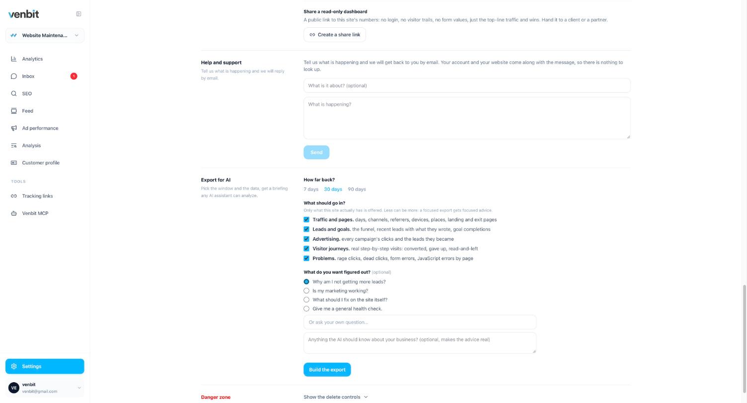
In Venbit's website analytics friction signals are filed with the site's other problems: rage clicks, dead clicks, form errors and JavaScript errors, each by page. The Export for AI screen below shows the four problem types as a tick box, so you can hand a week of them to Claude or ChatGPT along with the question you want answered, and the same list is what Claude reads when you give it a Venbit MCP key and ask where the friction is.
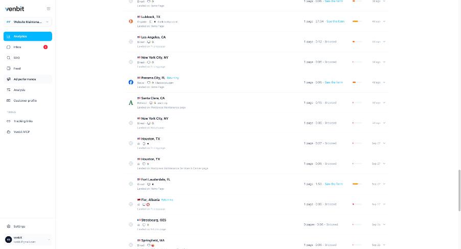
The second place to look is the visitor trail. A rage click is one step in one person's visit, and the steps around it say what they wanted. In the Venbit app for iPhone a lead opens to its trail, which is where I read them, because a rage click on a phone is best understood on a phone. Open your own site at the same screen size and tap the spot.
The trail is also where the rage click gets its meaning. Someone who read the pricing page, opened the contact page, rage clicked the submit button and left is a lost lead with a cause attached. The visitor who rage clicked a photo in the gallery and then read three more pages was mildly annoyed and stayed. Reading one visit step by step is the next article in this cluster.
Venbit does not record sessions. Microsoft Clarity does, replaying the mouse movements, clicks and scrolls of a visit, and it flags rage clicks too, free, so watching the cursor shake is a Clarity job. What Venbit gives you instead is the list ranked by people affected, next to your leads and your rankings, with no recording of anyone.
Whether to worry
One person, once, is noise. A visitor on a train with a bad signal clicks a button four times because the page froze, and no fix on your side would have helped. The ranking by people exists so that case never reaches the top.
Several different people on the same element is a different thing, and the element's location decides how much it matters. A dead click on a decorative photo in the footer costs you nothing. Four clicks on the submit button of your quote form, or on the phone number in the header, is a lead leaving. Check the page in the row against the pages that lead to your form, because the reasons people give up on a form are mostly things the problems list has already named.
Phones deserve a separate look. Most friction I find comes from a layout that works at a desktop width and breaks at a phone's. A button pushed under a sticky header, a menu that only opens on hover, text that overlaps a link. If the rows with the most people are all Mobile, the site is broken on a phone and that is the fix, not the button.
Fix the element, then watch the row
A fix is only a fix when the row goes away. After you repair the button or turn the number into a telephone link, the element should drop out of the list over the next week as new visits arrive without hitting it. If it stays, the fix did not reach the people who were hitting it, which on a small business site means it did not reach phones.
When the same site keeps producing new rows on different pages every month, the problem is the build and not any one button. A list of ten frustrating elements is one of the signs a website needs rebuilding, with the evidence attached.
Related services
More on reading your website's numbers
Every question in this series, from Website Analytics for Small Business Owners.
Leads inbox4
Ad performance4
SEO tracking3
Visitor behaviour4
- What Is a Rage Click? The Definition and Why It Costs You Leads (you are here)
- How to See What Visitors Do on Your Website, Step by Step
- Which Pages on My Website Get Read? Your Most Visited Pages, Counted
- Why Do People Abandon My Contact Form? How to Find the Field
Feed and notifications3
Goals and measurement4

Tony Carnevale
Founder, Venbit
Tony started Venbit in Mill Creek, WA in 2011 and still does the work: web design, SEO, and the website analytics product the company builds and runs for its own clients. The numbers and screens in his articles come from that product, not from a content mill.